about
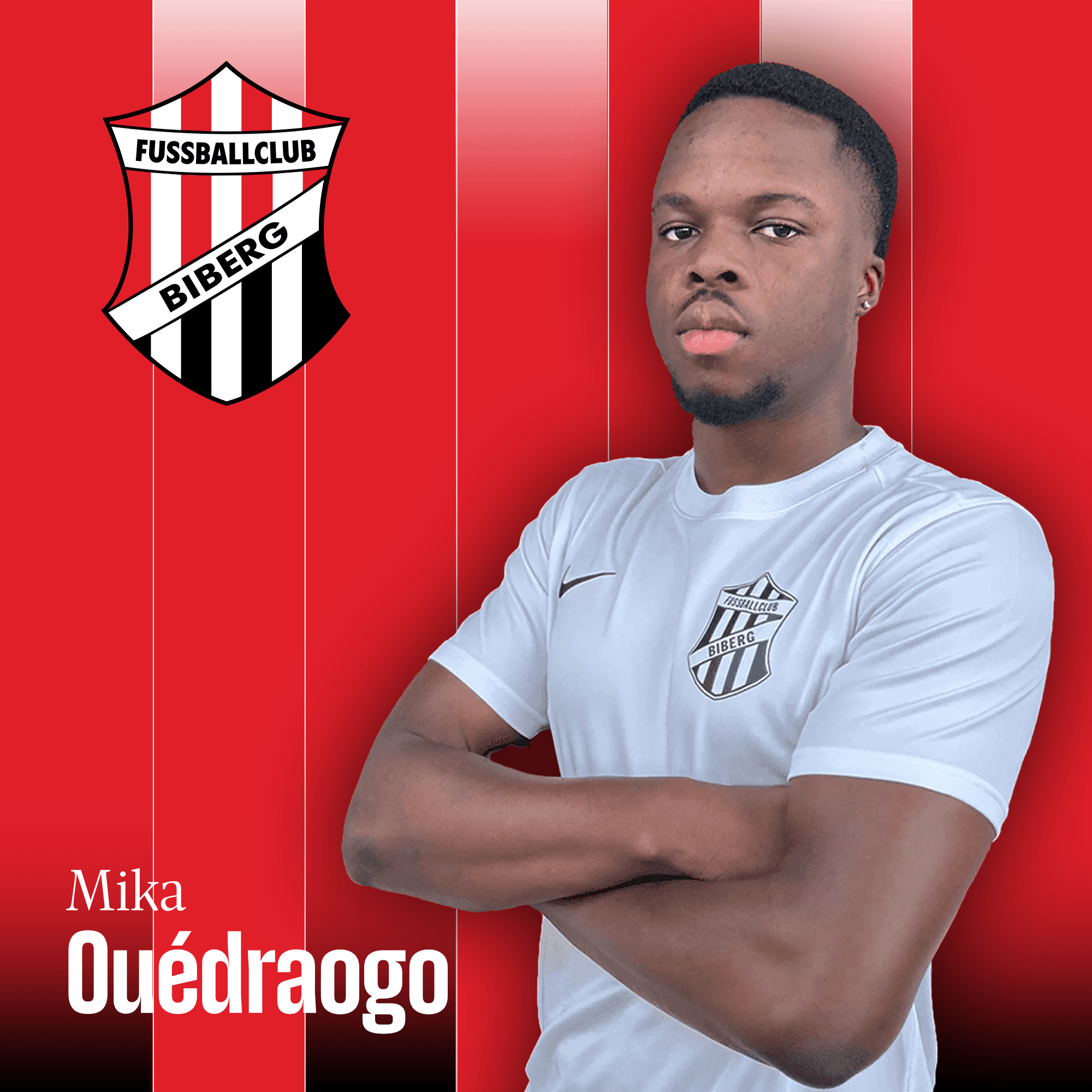
A football club is not a startup. Its identity isn't something you invent — it's something people already feel, often for generations. So the brief for FC Biberg was never to replace what was there, but to sharpen it. The crest stays. It carries too much history and too much meaning to the people who wear it to be thrown out for the sake of novelty. What it needed was not reinvention but respect: a modernization that clears away the clutter, tightens the forms, and lets the emblem read cleanly at any size — on a jersey, a scarf, a phone screen, or a stadium wall — without losing the character that made it recognizable in the first place.
The work happened in close exchange with the club rather than at a distance from it. That mattered. A community club belongs to its members, its fans, and the town itself, and a rebrand imposed from outside would have felt like exactly that — imposed. Conversations with people from Biberg, with supporters, with the club itself shaped the direction from the start and kept it honest. The goal was a brand the people around it would recognize as theirs, not one they'd have to be talked into.
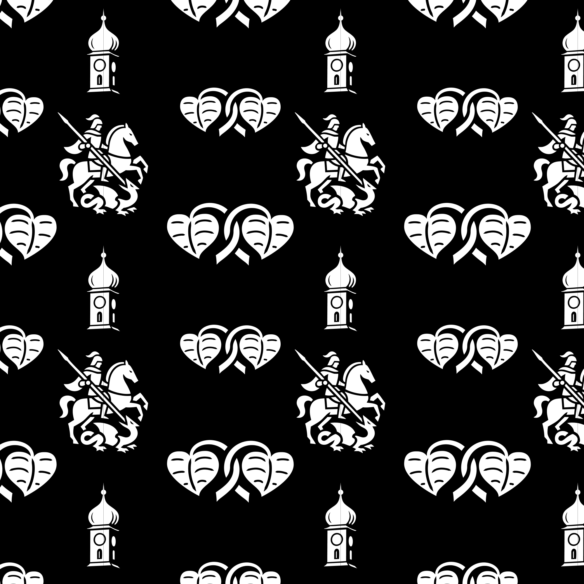
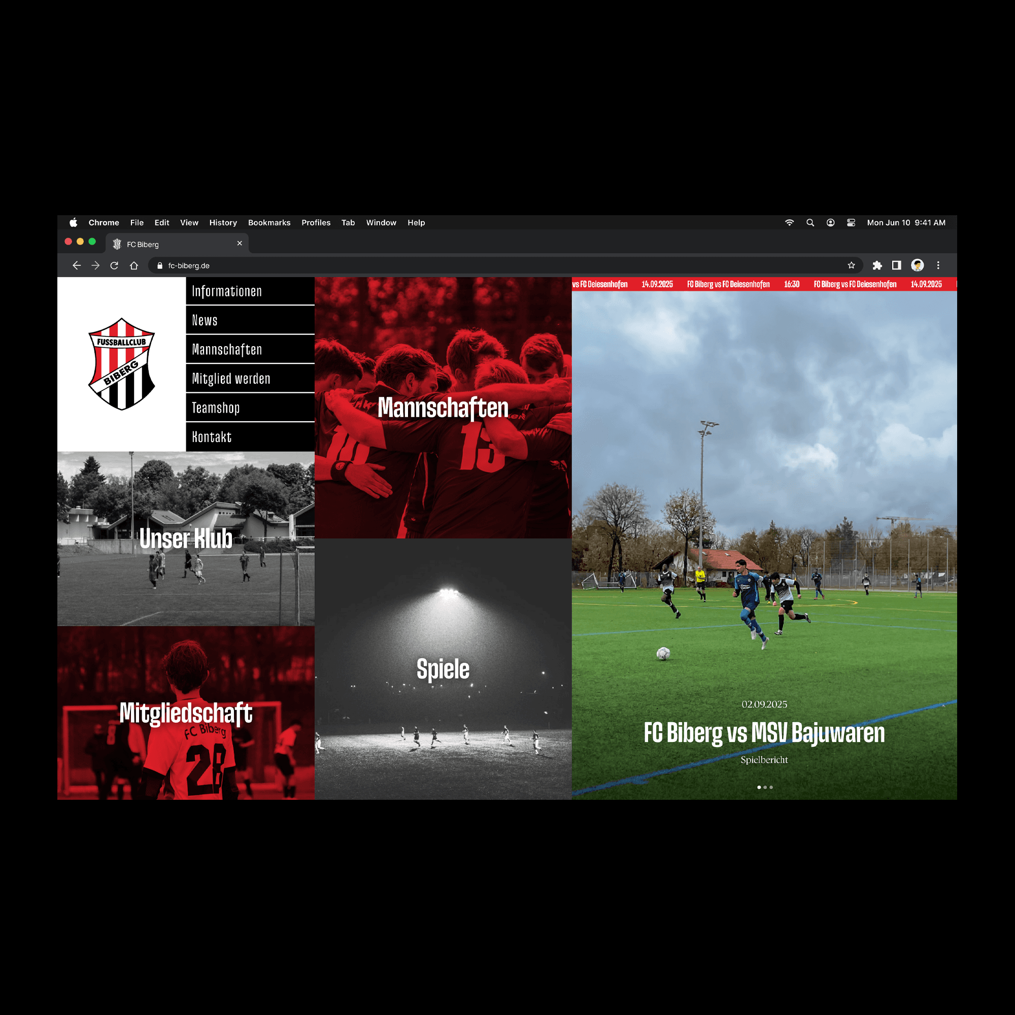
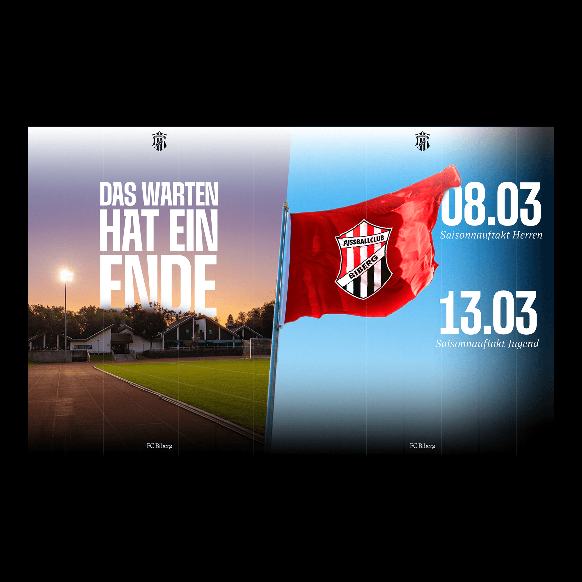
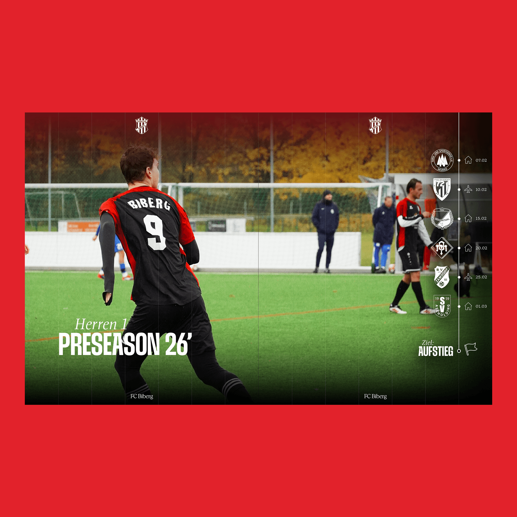
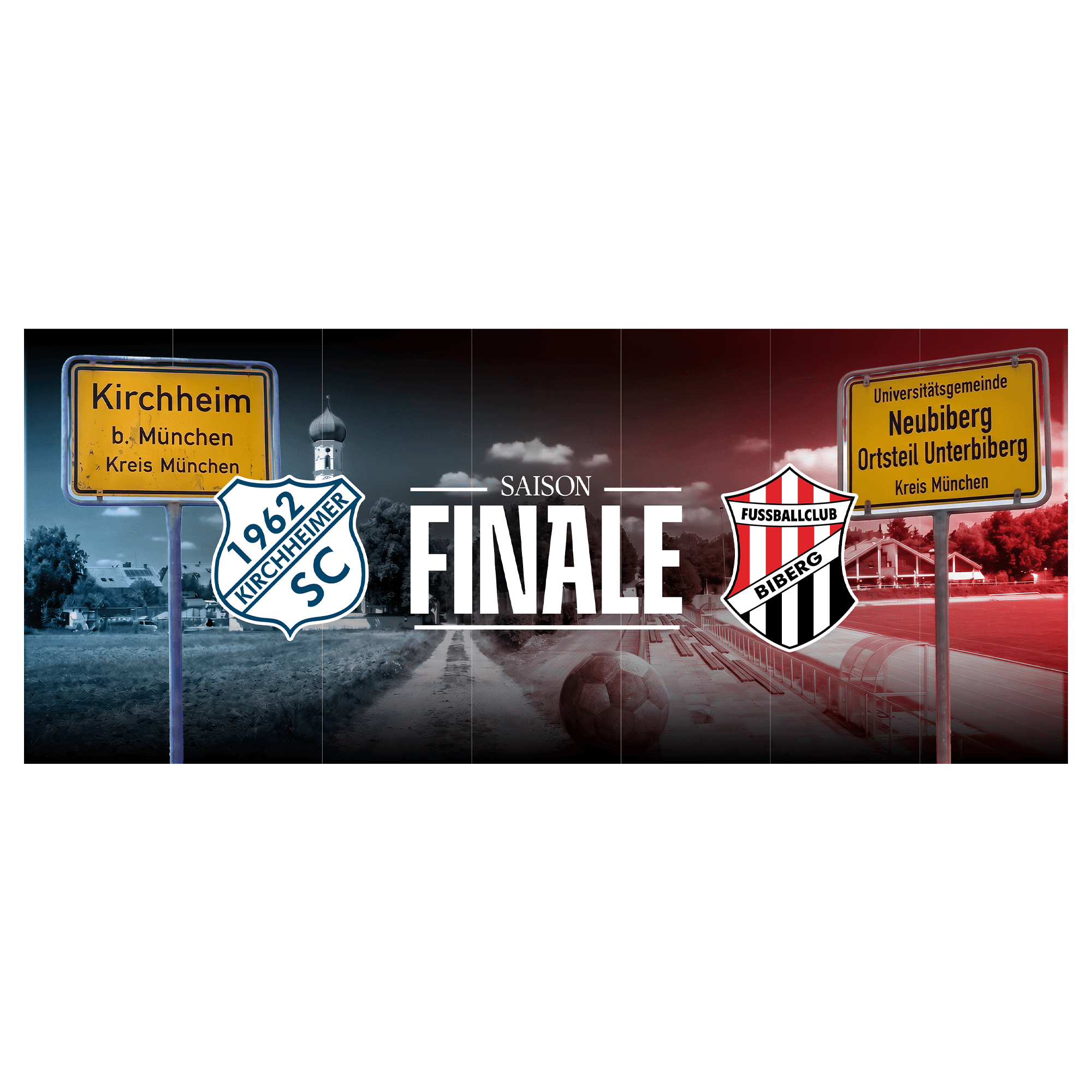
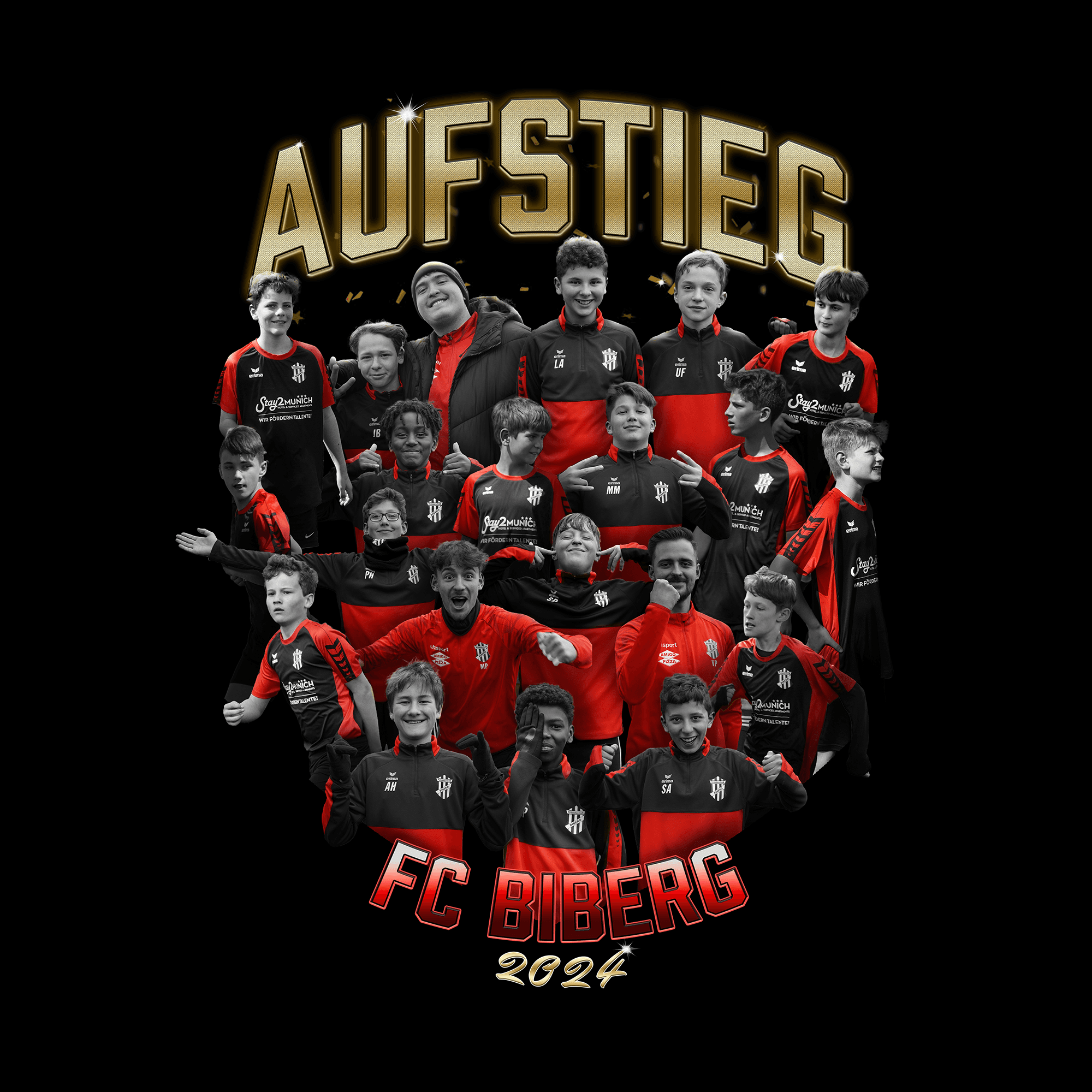
From there, the task was to define a visual language broad enough to hold the whole club together — not just a cleaned-up crest, but a full system. That meant a considered approach to typography, color, and layout, and a set of motifs and elements drawn from the place itself: the local details, landmarks, and character of Biberg that give the club a sense of belonging to somewhere specific rather than nowhere in particular. Rooted in its origin but built to travel, the system had to work across everything a modern club touches — matchday graphics, social media, merchandise, signage — and stay coherent the whole way through.
The larger ambition was distinctiveness. The Munich area is crowded with clubs, and most of them look more or less alike. The point of the rebrand was to give FC Biberg a presence that couldn't be mistaken for anyone else's — an identity confident enough to stand apart in that landscape while still feeling grounded in the town it comes from. Standing out and staying true to its roots were treated as the same goal, not competing ones.
What results is a club that looks like itself, only clearer. The history is intact, the crest still theirs, but the way FC Biberg presents itself now matches the pride the people around it have always had for it — and gives the club a foundation to build on as it grows into the years ahead.
credits